Missing homes, gas-friendly migration, and the rise of car dependency

In this edition
- Housing affordability and the backdrop of a supply crunch
- Gasoline prices, migration patterns, and the danger of non-discretionary miles traveled
- The SEC climate disclosure proposal will help but does not go far enough
Housing affordability and the backdrop of a supply crunch
The US is facing a major housing affordability crisis today. A few graphs help us understand one of the main drivers of that crisis: the simple lack of supply.
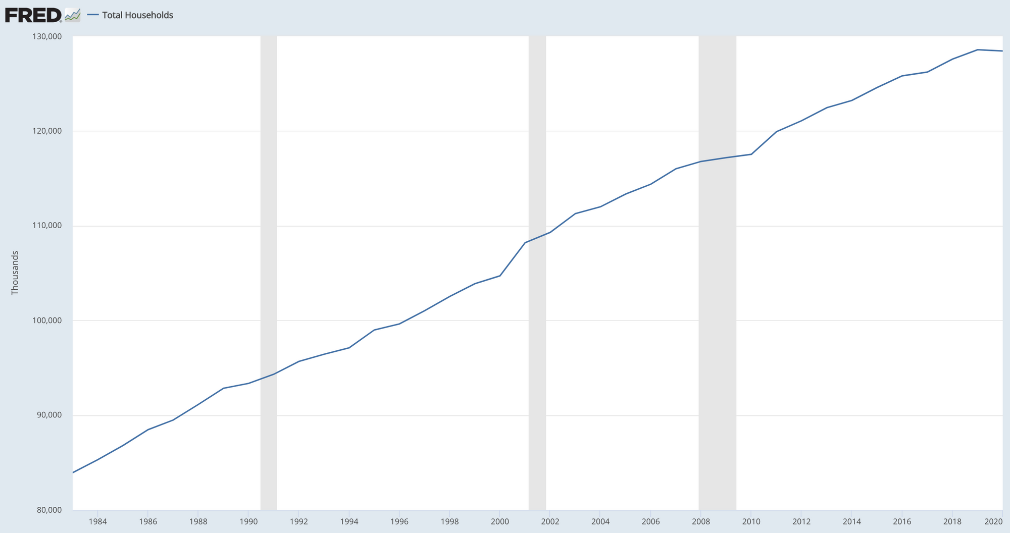
The first graph shows the number of households in the US over the last 40 years. The Census defines a household to be a group of persons occupying a single housing unit as their usual place of residence. That's a pretty good proxy for housing demand, but not perfect – because overly expensive housing could blunt new household formation (e.g., young person decides to continue living with parents) and/or entice existing households to collapse into some other household (e.g., increased velocity of couples deciding to live together). Nevertheless, it gives us a view into housing demand. What the graph makes obvious is that there has been a secular increase in the number of households over the past four decades.
The second graph below shows the number of housing units per household over the last two decades. Note that this ignores the actual distribution of housing unit ownership (which we know is skewed) and simply compares the number of housing units, on the one hand, and the number of households, on the other hand.
What we see here is that the ratio rose steadily through the years of the housing bubble, peaking in 2010, after which it declined sharply. Only very recently does the ratio rise again. Despite that recent rise, since about 2012 the number of housing units per household has been low.
The third graph shows housing inventory over the last four decades. Inventory refers to active properties on the market, not the stock of all units. A low inventory implies that there isn't much in the market for buyers to buy.
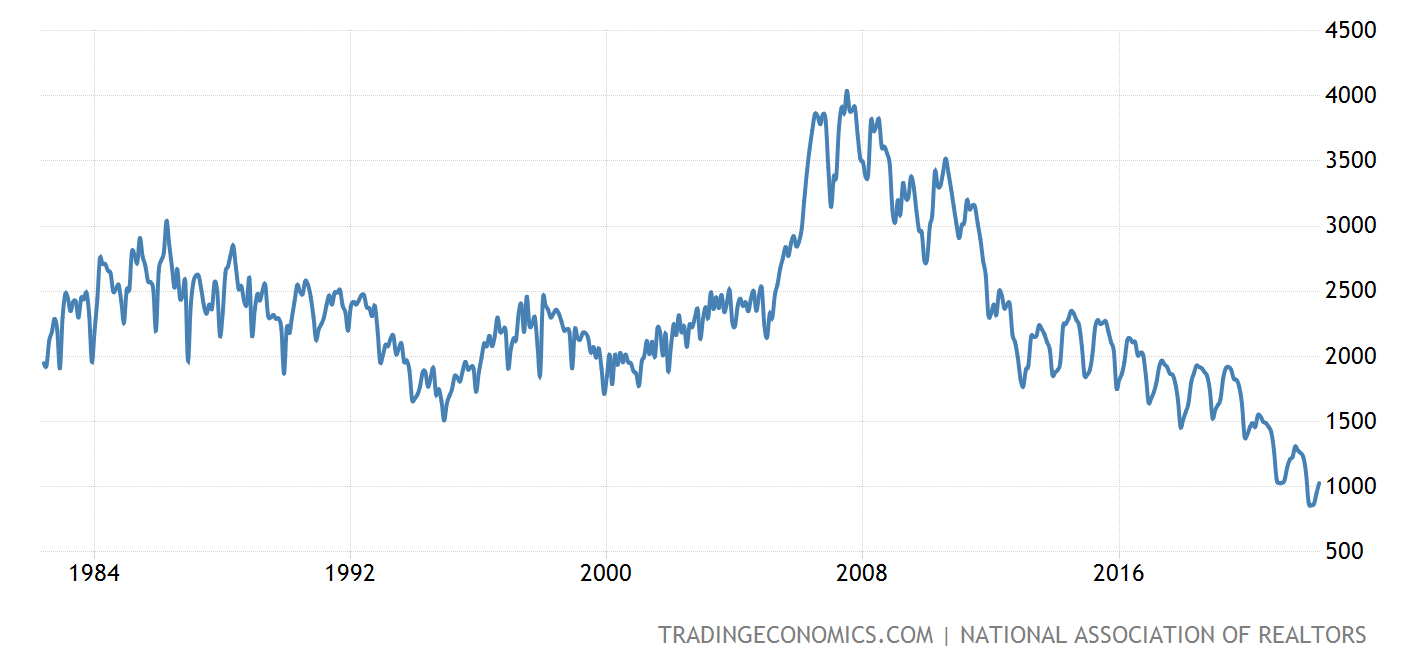
As you can see in this graph, inventory today is near a 40-year low. Note one other specific thing about this graph: inventory has for the most part been in secular decline since the peak of the housing bubble in ~2008. There was a steep decline post-bubble and a slight plateauing after that, but at a high-level, from peak to trough, the trend line is pretty obvious. This is important to note because more than a few analysts blame today's low inventory on pandemic factors, like the spike in homeowners refinancing mortgages to take advantage of extremely low interest rates, thereby diminishing volume coming onto the market. But the inventory decline started well before the pandemic and before rates hit rock bottom.
The fourth graph shows the number of housing starts over time. A housing start occurs when a new home comes onto the market. It's important to distinguish housing starts from housing inventory. While in most goods markets, inventory is equivalent to starts, in housing it definitely is not because most homes bought and sold in the run of a year are not new.
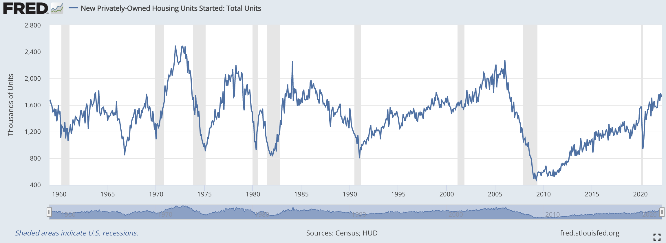
Putting this graph side-by-side with the previous one (housing inventory) is instructive. In the run up to the 2008 housing crisis, both inventory and new starts rose in a similar way – in both cases to near peaks. In the wake of the bubble bursting (~2008), both inventory and new starts collapsed. But then starting in ~2010, the two trends diverge. New starts rise rapidly, to the point where today they are almost on par with peak new start periods in the past; yet inventory's decline only deepens over this same period.
Key take-aways here are that housing starts nearly disappeared in the immediate wake of the housing crisis and that, despite the recovery in housing starts since then, the pace of new starts isn't high enough to make up for the gaping chasm that in new home creation that followed the crash.
As the National Association of Realtors (NAR) points out in a 2021 research note, "while the total stock of U.S. housing grew at an average annual rate of 1.7% from 1968 through 2000, [it only] grew by an annual average rate of 1% in the last two decades, and only 0.7% in the last decade." All of that in the context of steady increases in the number of households in the country.
That mix creates the conditions for price escalation. Of course there are other factors, like the effect that quantitative easing and pandemic-era fiscal supports had on increasing money supply and household savings, both of which increased the number of dollars chasing home supply. But the context of low supply is of crucial importance in understanding the longer-standing problem of un-affordability.
Gasoline prices, migration patterns, and the danger of non-discretionary miles traveled
As gasoline prices continue to spike, we're seeing early signs of demand destruction. A quick look at gasoline stocks (storage, not equities) tells us that prices are likely to go even higher as we hit peak driving season. For the many households that moved to suburban and exurban locations and to secondary and tertiary cities without much transit over the past few years, this will present a nasty surprise.
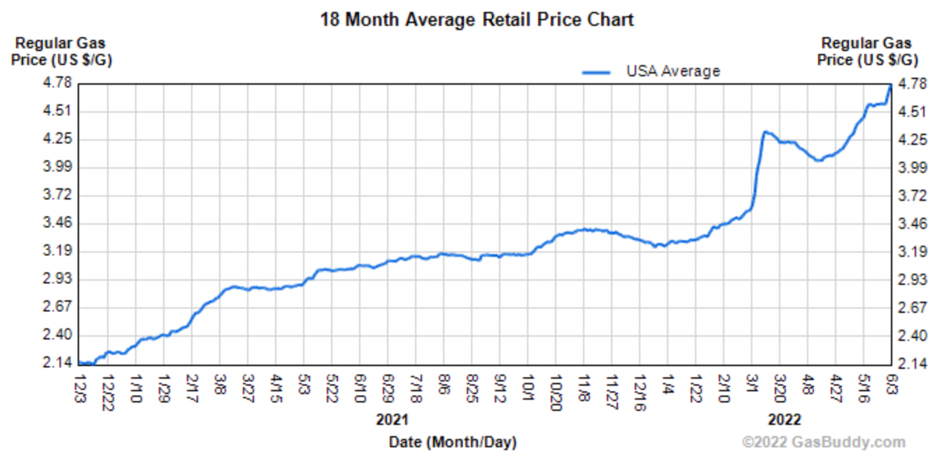
The graph below shows average gasoline price in the US over the last 18 months. Not a pretty sight for drivers. $4.77 a gallon is higher in inflation-adjusted terms than at any other time in the past decade.
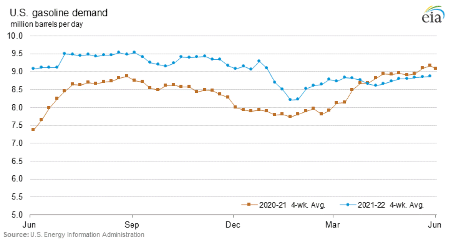
The graph below shows total demand for gasoline in the US. The blue series shows the evolution of demand over the past year, while the red one shows the same for the prior year. Demand this year outpaced that of last year as the COVID lockdowns eased, but driving demand has fallen since the beginning of the Russia-Ukraine war and the resulting fallout for crude markets globally. This is the sign of some demand destruction.
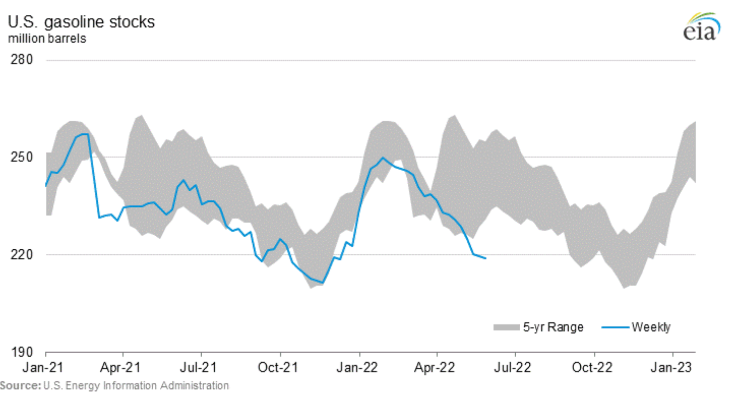
The next graph is an important part of the high price story. Here we see the outsized drawdown in gasoline stocks in the US. Compare the blue line, which represents this year, to the grey zone, which represents the observed range over the last 5 years. Stocks are abnormally low right now. When stocks are low, there is greater pressure on prices.
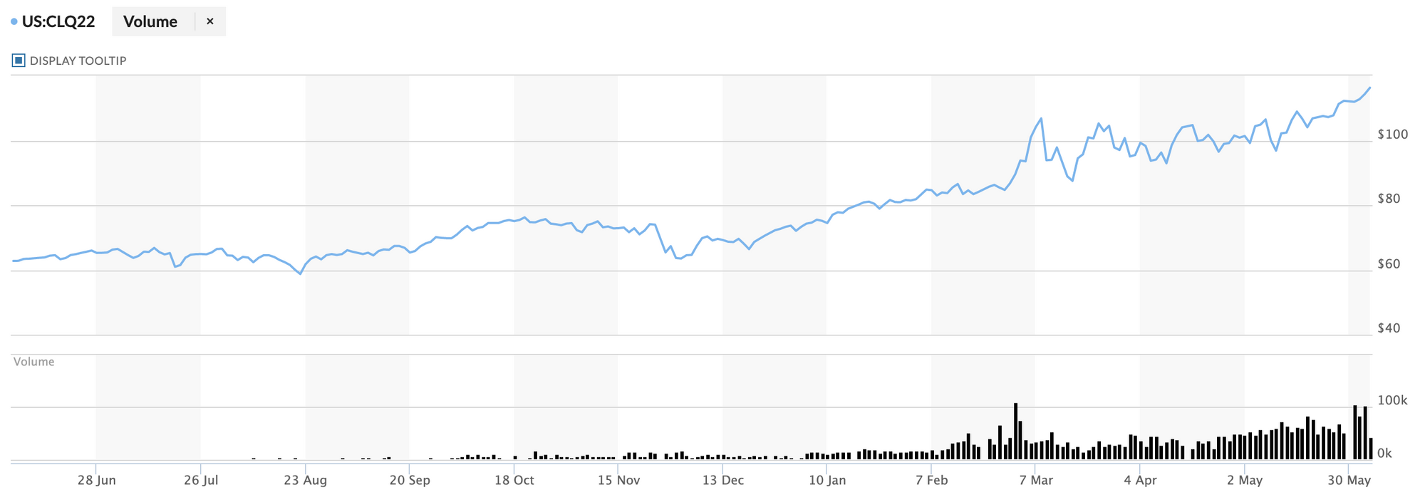
That low stock problem is causing forward contracts for crude oil to jut upwards. The graph below shows the August 2022 contract for crude. Note the very recent uptick in price. Of course there are other factors influencing this, but the production of gasoline takes about 40% of crude oil stock so dynamics here really matter. And new supply, either through OPEC+ expanding production or through domestic production coming on stream, won't have a big impact in the near term, especially when weighed agains the reopening of the Chinese economy, which promises to add substantial demand to the global crude market.
The end result here is that drivers are in for an increasingly painful summer. Some discretionary driving will decline or disappear, as we see in the small drawdown in gasoline demand above. But a lot of miles aren't discretionary given the way cities are built and where people have moved in recent years.
The average US family consumes about 90 gallons of gasoline per month, which translates to about $430 at current prices. That's about 4% of mean before-tax household income.
As the graph below shows, vehicle miles traveled (VMT) is not particularly responsive to price shifts, at least not in the price range we've seen in the past. Seasonality matters in predictable ways, but price levels do not.

In part, this is cultural. Americans like to drive more than people elsewhere, and they often do it alone, which multiplies the number of vehicles on the road. But that culture is itself partly the product of policy and market dynamics that have created a country with more roads and parking spaces and fewer high speed trains, subway systems, and so on.
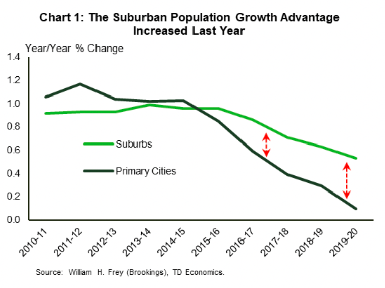
One important driver of the demand for gasoline has been suburbanization. As the graph below shows, the suburban population growth advantage has been growing since about 2015. This chart stops just before the pandemic took off, so it doesn't even include the massive uptick in households moving out of cities and into suburban and exurban locations that took place over the past two years.
Suburbanization matters because people tend to drive a lot more when they live in the suburbs than in denser, more mixed use parts of a city or region. Often people object to this point because work from home has become a widespread phenomenon in recent years and/or because many offices themselves have moved to the suburbs, but these objections are mistaken for a few reasons.
First, according to the most recent data from the American National Household Travel Survey, about 75% of household vehicle trips are for non-work reasons (e.g., groceries, schools, services, recreation), while only about a quarter are for commuting to work. These non-work trips don't disappear for remote workers. At best, they are replaced by some home delivery service that has a slightly higher chance of being more efficient or electrified, but in general VMT has not declined overall because households are still driving for many of these trips.
Second, a study by McKinsey estimated that only about 22% of workers will be able to work remotely for 3-5 days a week, and approximately 61% of the US workforce can't work remotely for more than a few hours a week. All of this suggest that a huge fraction of VMT are not discretionary.

Third, while it's true that suburban office is hot in the real estate market these days, the lion's share of offices remains in urban areas. And for suburban offices, driving is still the norm for employees and visitors. It might even be worse than it was in the past because it removes most opportunities for public transit and walking to work that might have existed for urban offices that have upped sticks and moved the suburbs.
But it isn't just suburbanization that is driving the increasing reliance on cars to get around. Which city people live in matters almost as much. According to data from the US Bureau of Transportation Statistics, in the state of New York suburban households drove 220% more VMT in the run of a year than did urban dwellers; yet that figure was only 124% for a state like Texas. That means that whether you lived in an urban or suburban location didn't make that big of a difference to your driving habits in Texas. The difference between Texas and New York is driven in large part by differences in urban contexts in the two states, with Texas more likely to have cities that lack high quality public transit and active transportation infrastructure, on the one hand, and easy non-car access to mixed use real estate (e.g., groceries, shops, parks, etc), on the other hand.
Below, I used Local Logic's location data to map access to walkable neighborhoods and nearby amenities and transit. The contrast between Boston and Houston is striking! Green represents good access, while red represents the opposite. Both maps have similar scales. What's obvious here is that, aside from a sliver of downtown Houston, most areas of the city have poor pedestrian access to transit and amenities, all but requiring a car if you can afford one.
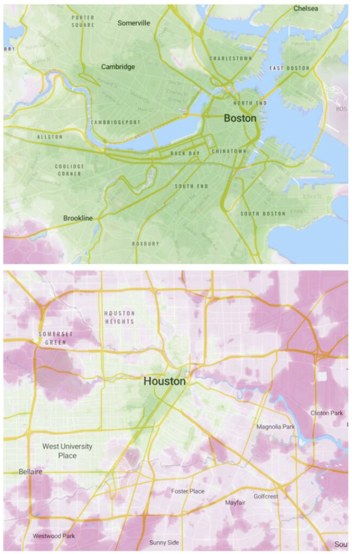
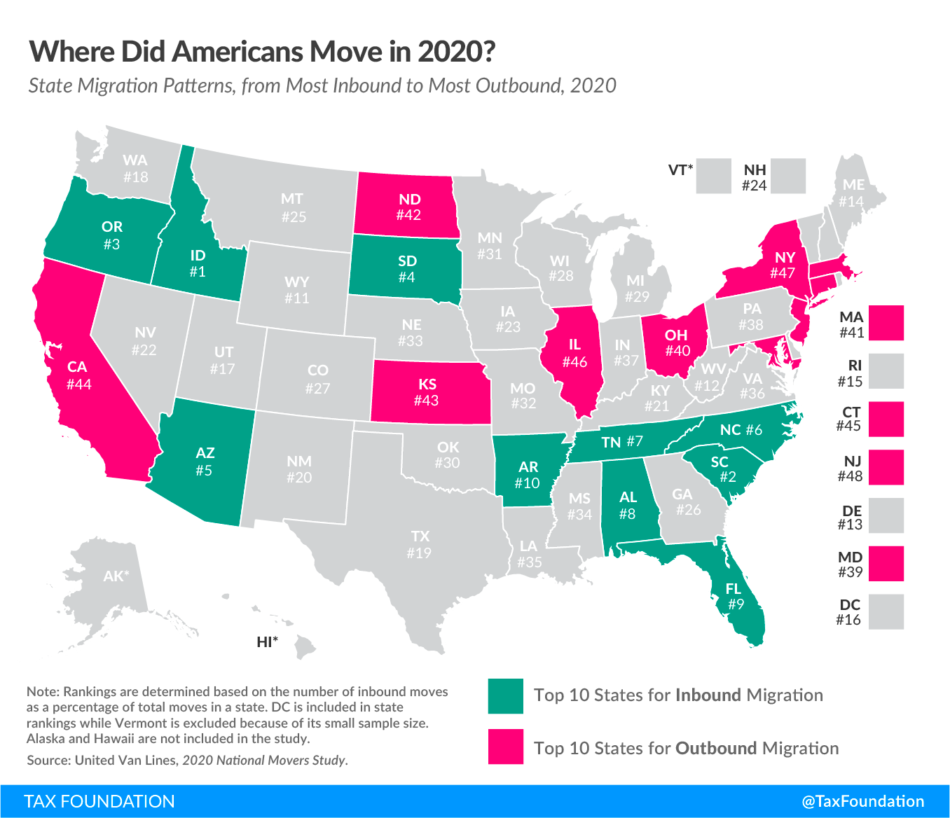
It isn't by accident that I compared those two cities. In recent years, Houston has been among the fastest growing cities in the US, while Boston and its environs have seen net out-migration. At a macro level, we're seeing flows of people into cities with poorer public transit options, poorer walkability, poorer active transportation infrastructure, and greater dependence on personal vehicles to get around. The graph below shows which states saw net in-migration and which saw net out-migration in 2020. In general, we've seen migration to more car dependent areas.
All of this means that an increasing number of households are becoming more car dependent at precisely a time when gas prices are surging to dangerous levels. It might cause some to question the logic of living far from transit and services in the first place.
The SEC climate disclosure proposal will help but does not go far enough
In late March of this year, the US Securities and Exchange Commission (SEC) released a proposal on climate-related disclosure that would be a massive step forward for visibility over climate risks and emissions footprints. But it falls short in one area that has important ramifications. I wrote a short post about this on Local Logic's blog this week. Here's the gist of the argument. For the full piece, check out the blog.
The proposed rule would require publicly traded companies to begin reporting on climate-related risks, governance systems they have in place to monitor and respond to those risks, and greenhouse gas emissions from the company's activities.

This is significant in that it will require much greater visibility into climate risks and emissions impacts for large actors in the economy. The proposal doesn't itself require companies to act on the information, but many investors want the information so that they can better manage their own risks and, in some cases, reduce their involvement in activities with a negative environmental impact. Beyond this, governments armed with better information about risks and impacts will be able to incentivize and disincentivize particular activities, sectors, etc. So the increased visibility will almost certainly elicit action.
The problem with the current version of the proposal lies in what it fails to shed similar light on. While companies will be required to report on Scope 1 emissions (those from direct company activities) and Scope 2 emissions (those from energy consumed by the company), Scope 3 emissions (emissions from upstream and downstream actors in a company's supply and value chains) will be treated differently. Specifically, they will fall under the SEC's 'materiality' paradigm, which leaves it up to individual companies to decide whether or not a specific activity is likely to be considered of material significance to a typical investor.
The SEC justified its use of the 'materiality' paradigm by pointing to the variable geometry of company context. Basically, it wanted to grant flexibility to companies to act according to their specific circumstances, not according to a top-down one-size-fits-all standard.
The problem with this is of course that companies don't always make good judgement calls on what is materially significant. Investors who disagree with a company's judgement can always challenge in court, but this kind of process can take years to work its way through the courts.
Empirically, we know already from looking at early greenhouse gas emissions reporting that companies frequently under-report on emissions from upstream and downstream activities that are of great significance. One excellent example comes from recent research done by MSCI showing that companies in the financial sector rarely reported on their 'financed emissions' (emissions from activities they invest in, loan to, provide financial services to, etc), despite financed emissions constituting 92% of their estimated overall emissions footprint (see graph below).

This reporting gap matters for a variety of reasons. It matters for understanding which actors drive and facilitate particularly harmful activities. But aside form impact, it also really matters for understanding risk. One financial institution might specialize in lending to emissions-heavy activities, while another might specialize in lending to emissions-light activities. In a context where emissions are increasingly regulated and penalized, those two specializations map on to two different risk profiles. Investors want better visibility into those risk profiles, yet the SEC's current proposal risks leaving some of the most relevant risk information unreported, as is the case for financial companies reporting today.
The SEC's hands clearly are not tied on this issue. It could decide to make Scope 3 reporting obligatory, or it could decide to do so only for the largest companies, or it could decide to do so only for Scope 3 activities that involve the most emissions-heavy activities, such as transportation and the burning of fossil fuels. Yes these decisions would impose greater reporting burdens on companies, which makes no reporting company happy. But in the process it would expose much more risk and emissions information that investors want in order to manage risk, and that federal agencies themselves want in order to better manage financial stability. The stakes are too high to justify the use of the materiality paradigm for all Scope 3 emissions.
For real estate companies and, well, any company with a real estate footprint (raise your hand if you don't have one!), this issue is important. Today, many real estate companies already report on some Scope 3 emissions, such as tenant energy use, but they ignore ignore some of the most important areas of Scope 3 emissions, such as household transportation. Yes, employee commuting sometimes get included, but this represents only about a quarter of household car trips. The other 75% are trips to get from one asset to another, yet no real estate actor or tenant company I've come across reports on any of these non-work trips, leaving them in the shadows of reporting. That's a bad place to leave one of the biggest fractions of emissions in the economy today.

Where homes, offices, stores, services, schools, and so on get located plays a big role in shaping the number and length of household vehicle trips. Yet despite the clear relationship between real estate decisions and downstream use phase vehicle emissions, these emissions are never mentioned in Scope 3 emissions reporting.
The example of a shopping mall is a great one. Malls are typically located in suburban areas with poor transit, pedestrian, and cycling accessibility. They also typically have huge parking lots to, not surprisingly, accommodate the thousands of cars used to ferry people to and from them. When a family drives to and from a shopping mall to make a purchase, its vehicle emissions are downstream Scope 3 emissions of the shopping mall and of the specific retail stores the family shopped at while there. Yet, despite shopping malls attracting thousands of car trips in the run of a day, none of these Scope 3 emissions tend to be reported on by real estate developers and investors.
There's no question that the shopping mall attracts those vehicle trips. There's no question that it stimulates those emissions. There's no question that any kind of policy or demand shift that would make driving much harder or more expensive would represent a risk for the shopping mall. There's no question that an event that blocked car infrastructure near the mall would have a harmful impact on the mall's business. So there is no question that the visitor car trips are very clearly relevant for monitoring risks and emissions for shopping malls. The same is true for all real estate assets.
In its current form, the SEC proposal won't compel real estate actors and their occupants to report on these kinds of transportation emissions. That is precisely why the proposal should be amended to make reporting on particularly important sources of emissions, like transportation, mandatory, even when they fall into the Scope 3 bucket.